
Alex L Dory · Online
An application form as a qualifying filter
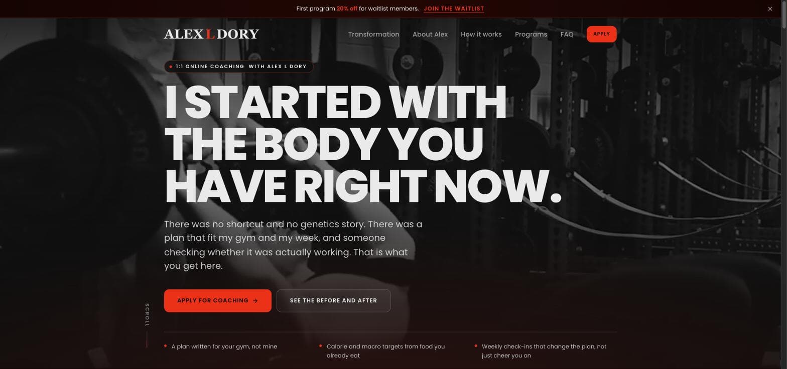
A 1:1 online coaching site where the primary CTA is an application, not a contact form. It filters people Alex cannot help and hands him real context before he replies.
- Client
- Alex L Dory
- Industry
- 1:1 online personal training and fitness coaching
- Location
- Online
- Year
- 2026
- Services
- Website design · Conversion rate optimization · Copywriting
Most coaching sites end at a contact form with two fields and a message box.
The coach gets "hey, interested in training" and burns a reply asking the four questions they needed in the first place. Half those conversations were never going to convert, and the coach found out on the second message instead of before the first.
Alex coaches one to one, online. His capacity is finite and his time is the product, so the site had one job: sort the people he can genuinely help from the people he cannot, before either party spends anything.
The application replaces the contact form
The primary call to action across the whole site is Apply for coaching, not Contact.
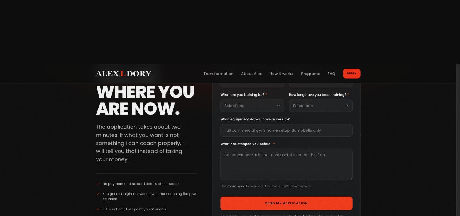
The form asks four things beyond name and email:
- What are you training for
- How long have you been training
- What equipment do you have access to
- What has stopped you before
None of that is decoration. Training goal and experience decide whether Alex is the right coach at all. Equipment decides whether a program is even writable for that person. And the last question is the one that actually predicts whether someone sticks, which is why its placeholder tells them to be honest and says plainly that it is the most useful thing on the form.
By the time a reply is warranted, Alex already knows what he is replying to.
Naming the friction instead of hiding it
An application asks more than a contact form, so the page has to earn it.
The section leads with what the reader gets rather than what they give: the application takes about two minutes, there is no payment and no card details at this stage, and if coaching is not a fit Alex says so instead of taking the money.
That last line does real work. The most common reason someone abandons a fitness enquiry is suspecting they are about to be sold to regardless of fit. Saying the opposite, in plain words, directly above the submit button, removes the reason to hesitate.
One action, repeated
There is exactly one conversion path on the site and it appears at every scroll depth: in the nav as a red Apply button, in the hero, and as the closing section.
Everything else on the page is evidence feeding that one decision. The before and after comparison is proof the method works. The programs section sets expectations on support level. The FAQ removes objections. None of them introduce a competing action, because a second CTA on a page like this only splits attention.
Design decisions
Near-black with a single signal red, set in a heavy condensed display face. The palette is deliberately narrow so the red only ever means one thing: this is the thing to click.
Motion is used on entry rather than on loop. Sections reveal as you reach them, which suits a page read top to bottom, and nothing moves once it has arrived.
The build is a statically generated Next.js site, so the pages that matter are already rendered when a visitor arrives from a phone on mobile data.
“The WebFlux team is simply outstanding. Their ability to merge design creativity with technical expertise helped us launch a flawless web app that scales with our business.”